IN THIS POST:
- Final Text
- Font research
- Final product
- Audience feedback
- Draft 1
- Draft 2
- Initial ideas
FINAL TEXT

Inner panel

STICKER:

SPINE:
BACK PANEL:

INNER PANEL (WITHOUT CD):

CD:

LYRIC BOOKLET
STICKERS
We initially did some experimenting for the lyric booklet which we took photos for in front of a green screen. Cutting out the image was harder than expected so it didn't look as professional as we would have liked. It was really tough to cut out the hair and the trousers reflected the green screen so it didn't look clean. Here is the first draft:

Here is the photoshoot we had:


ARTIST REVIEWING OWN DIGIPAK
FAN OPENING ON YOUTUBE
TRACKLISTING
We decided to have 14 tracks on our digipak, 3 of which are "live from Miami, FL". This is the listing we decided to go for:- all the good girls go to hell
- I dare you
- no
- left crowded
- crucifixion
- successful failure
- trapped in reality
- shadow
- different notes
- sweet tooth
- I'm your doll
- friction (live from Miami, FL)
- age too slow (live from Miami, FL)
- enemy (live from Miami, FL)
We chose songs that we think would work well with Billie Eilish's image and brand. For example, adding in the religious connotations. We also wanted to add a lot of contradictory names, like age too slow and successful failure. I wrote my own lyrics to the song different notes:I look you in the eye
You make me wanna cry
As you're waving goodbye
But I just wanna try
We should be perfect together
But our paths don't lead to forever
We're singing different songs
Everything you wrote
How can this be wrong?
We're on different notes
How could we have known
Our time has overgrown
I'm feeling so alone
I'm drawing blood from a stone
We should be perfect together
But our paths don't lead to forever
We're singing different songs
Everything you wrote
How can this be wrong?
We're on different notes
We're singing different songs
Everything you wrote
How can this be wrong?
We're on different notes
CHOSEN IMAGES/ART
These are our chosen images for the digipak:


We think that these are really striking visuals which will work perfectly for our Digipak.
We decided to have 14 tracks on our digipak, 3 of which are "live from Miami, FL". This is the listing we decided to go for:
- all the good girls go to hell
- I dare you
- no
- left crowded
- crucifixion
- successful failure
- trapped in reality
- shadow
- different notes
- sweet tooth
- I'm your doll
- friction (live from Miami, FL)
- age too slow (live from Miami, FL)
- enemy (live from Miami, FL)
We chose songs that we think would work well with Billie Eilish's image and brand. For example, adding in the religious connotations. We also wanted to add a lot of contradictory names, like age too slow and successful failure. I wrote my own lyrics to the song different notes:
I look you in the eye
You make me wanna cry
As you're waving goodbye
But I just wanna try
We should be perfect together
But our paths don't lead to forever
We're singing different songs
Everything you wrote
How can this be wrong?
We're on different notes
How could we have known
Our time has overgrown
I'm feeling so alone
I'm drawing blood from a stone
We should be perfect together
But our paths don't lead to forever
We're singing different songs
Everything you wrote
How can this be wrong?
We're on different notes
We're singing different songs
Everything you wrote
How can this be wrong?
We're on different notes
CHOSEN IMAGES/ART
These are our chosen images for the digipak:


We think that these are really striking visuals which will work perfectly for our Digipak.
FONT RESEARCH
DRAFT 2

For our second draft, we decided to steer away from Photoshop so that we could have more creative control, as we found that Photoshop felt quite limiting, due to the lack of knowledge we have on the software. We think that it's not massively beginner-friendly, so we reverted to working with PicMonkey. Here is the draft:
Our notes on this draft:
- This colour scheme is significantly different to our first draft. After the audience feedback, we've decided to go for the colour-pop look, rather than it being so dull.
- The inner and outer panels don't gel very well together, but we like the concept of lyrics overlaid onto the inner panels.
- We've decided not to have the artist name, which Billie Eilish has done before, but we did want the album title and I think the font is good for that.
- I like the HD picture in the front and then the spine and back panel are blurred.

For our second draft, we decided to steer away from Photoshop so that we could have more creative control, as we found that Photoshop felt quite limiting, due to the lack of knowledge we have on the software. We think that it's not massively beginner-friendly, so we reverted to working with PicMonkey. Here is the draft:

Our notes on this draft:
- This colour scheme is significantly different to our first draft. After the audience feedback, we've decided to go for the colour-pop look, rather than it being so dull.
- The inner and outer panels don't gel very well together, but we like the concept of lyrics overlaid onto the inner panels.
- We've decided not to have the artist name, which Billie Eilish has done before, but we did want the album title and I think the font is good for that.
- I like the HD picture in the front and then the spine and back panel are blurred.
AUDIENCE FEEDBACK
There was a lot of positive reception for the front and back panels, with just a few points to changes, but the inner panel wasn't as successful. The colours don't merge very well, so we will be changing it, almost entirely. The lyrics were praised, and we like them, so we will be keeping them. We're also going to make the image in the inner panels slightly clearer, as people weren't able to tell that there was a person in it.
There was a lot of positive reception for the front and back panels, with just a few points to changes, but the inner panel wasn't as successful. The colours don't merge very well, so we will be changing it, almost entirely. The lyrics were praised, and we like them, so we will be keeping them. We're also going to make the image in the inner panels slightly clearer, as people weren't able to tell that there was a person in it.
DRAFT 1
Our first digital front cover draft was created on Adobe Photoshop 2021. It was our first time using this application. Our draft: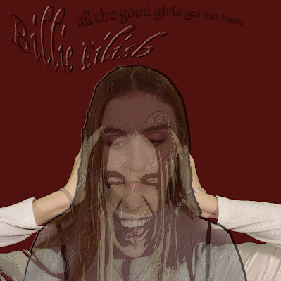

Our notes on this draft:- Follows a colour scheme we are likely to include in our final product
- We are likely to include 2 visible versions of 'Billie Eilish' on our front cover, expressing different emotions, much like this draft
- We feel the title and album title fit well into the cover, following conventions, yet also being unique as many are in the dark pop genre
- The serif, bubble, dark red, white and black font works well, however we will search for fonts that work better, and stick to what Billie Eilish uses generally
- We have added and played around with filters to the images, which make it stand out. When we create our next draft, we will use makeup to further imply the contrast between who this character is/isn't.
- We will also use different clothing, hair etc. to connote the meaning of our Digipak
- We will play around with layering more, and will look at using the magnetic lasso tool on Photoshop to create more abstract visuals
- Planning for our first back panel and inner panels, we will note up our plans for the back panel theme, inner panel themes and other aspects of the conventional Digipak
- We want there to be a religious element on the front cover as well
- We will look at having a strong font contrast between the album title and artist name
Here is a short video explaining the process of getting to our first draft...
Our notes on this draft:
- Follows a colour scheme we are likely to include in our final product
- We are likely to include 2 visible versions of 'Billie Eilish' on our front cover, expressing different emotions, much like this draft
- We feel the title and album title fit well into the cover, following conventions, yet also being unique as many are in the dark pop genre
- The serif, bubble, dark red, white and black font works well, however we will search for fonts that work better, and stick to what Billie Eilish uses generally
- We have added and played around with filters to the images, which make it stand out. When we create our next draft, we will use makeup to further imply the contrast between who this character is/isn't.
- We will also use different clothing, hair etc. to connote the meaning of our Digipak
- We will play around with layering more, and will look at using the magnetic lasso tool on Photoshop to create more abstract visuals
- Planning for our first back panel and inner panels, we will note up our plans for the back panel theme, inner panel themes and other aspects of the conventional Digipak
- We want there to be a religious element on the front cover as well
- We will look at having a strong font contrast between the album title and artist name
Here is a short video explaining the process of getting to our first draft...
AUDIENCE FEEDBACK
The audience feedback we got on this draft was not massively positive. I agree that it's not the most striking visual and it's hard to fully see the facial expressions. I think it's very different to the vibe we're giving off in the video, so I think that we should make it a bit more coherent.
INITIAL IDEAS
Our initial ideas are to play off of the contradictory music video we've created/the song we made the music video to. As the song is called all the good girls go to hell, we're thinking of creating an image with two faces which have a lower opacity so we can see the difference between the two images. I think that this would look best with exaggerated facial expressions in a close-up.
No comments:
Post a Comment
Please note all comments are moderated